Thursday 8 May 2014

Evaluation Question 4- How did you use new media technologies  in the construction and research. planning and evaluation stages?

we are constantly seeing new technologies being used to help advertise and promote different areas of the media world, such as the music industry. Without technologies such as these our planning and the task itself would have been virtually impossible to do.

Facebook
We used the instant message on Facebook so that we could constantly keep in contact with each other to arrange filming schedules and other aspects of the project. We also used the messaging service to write to The Arctic Monkeys's page to inform them that we were using their song so as to not go against any copyright laws. We also posted our video onto Facebook and received some positive comments and likes which told us that we had made a good product.


Youtube
We watched professional music videos that had already been made by bands of the genre we chose, this inspired us as we ll as giving some of the generic conventions we would use for our own video. We also looked at some of the music videos from other colleges to see what the standard was like and what we needed to aim for with our own piece.

Blogger
We used blogger as a journal so that the group could keep up with each others work as well as our teacher so we could receive instructions and guidance on how to improve. There was also a wide community of bloggers on the site that we could receive criticisms and encouragement on how to do our work. 
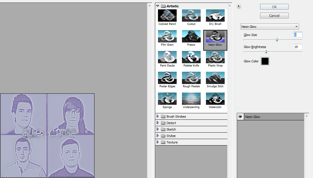
Adobe Photoshop
Photoshop played a massive part in the production of our product, we used it design our album cover, digipack and our magazine advert. To create the image we had to edit each individual photo of the band members the same filter. We used the filter neon glow to give each band member their own individual colour. We then used the paintbrush tool so as to edit out the shadows that had appeared from the original images. 
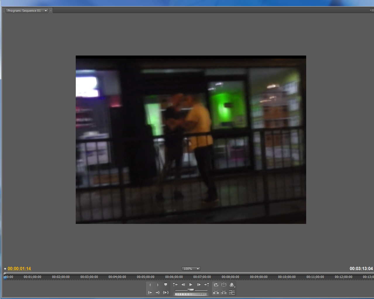
Adobe Premier Pro
We used this to create the video for our project, having already used it last year to make and edit our two minute film opening we were quite familiar with the programme. The hardest part of the video was syncing up the lyrics to the singers movements. 


Evaluation Question 3-What have you learned from your audience feedback?
To understand what our audience thought of our video we posted it to several different mediums to find out how well it was received. We also received some different tips on how we could improve it which we incorporated from our first draft to our final piece.

Facebook
Robbie posted the video onto his Facebook wall and Cameron then shared it onto his, we did not receive that much feedback on what we could do with the video but we did receive a lot of like so we could tell that there was a positive reaction from the video. We didn't receive any negative comments on the video however so we took that as a good thing. 

After posting on Facebook we felt that this was not a good medium as we did not receive a lot of comments and the ones that we did seemed biased. This was because we could only show the video to people we already friends with so they might not want to comment negative things on the video.

Youtube
After posting our first draft of the video we received some comments saying that it lacked a decent story line and due to it having no colour at all it was quite boring. The singing was also out of sync with the music. 

We as a group agreed with this comment as Youtube had slightly altered the lip syncing. The draft received more likes so we took this as quite positive feedback. 
The other comments we received seemed to agree with Matthews comments and ours stating that the video looked very professional. Although it was slightly out of sync we got the impression that our video was quite well done. 


Classroom feedbackTo get some feedback from our peers we had a lesson dedicated to watching each others videos and giving constructive criticisms, and compliments which definitely gave us some ideas on what we needed to improve on, some of the comments were:
  1. The syncing of the video was off
  2. Maybe needed more colour (before using colour pass)
  3. Needed more narration shots (before we added the bouncer scene, and the car scenes)
  4. We needed a bass guitarist (we originally began with just a guitar, no bass.. that idea was quickly changed)
All of these comments came early on enough so that we had a chance to improve on these, and overall the session was quite helpful as it gave us some criticism which was from a neutral perspective- from people who are doing the same thing.

ConclusionThis feedback gave me confidence of saying that the piece is now complete, with nothing more to do with it, though it's hard to say considering the people on Facebook who liked it are friends therefore they could be biased but overall it was quite positive. The feedback we recieved would have been very positive for a start-up band because Facebook friends and people on Youtube would most likely have been at an equal age to our target audience of 15 - 25. Although Facebook friends are slightly biased overall it would give you an idea of what fans might think of the video.
The classroom feedback was probably the most useful as it gave us an idea of what our peers who were in the same boat as us thought about our video in comparison to theirs- which was very useful information.

Wednesday 7 May 2014

Evaluation Question 2- How effective is the combination of your main product and ancillary texts?
I felt that our combination of music video, digipack, magazine advert and album cover all linked in very well with each other giving the project a professional feel that looked as though we were showcasing a real up coming band.

The music video
The purpose of our music video was to appeal to a Brit Indie market whilst also having an appeal within popular music. We wanted to take our band into the mainstream taking inspiration from bands such as The Arctic Monkeys, The 1975 and The Courteeners. To do this we made a video based on the lyrics of From The Ritz to the Rubble, this incorporated aspects of drinking, relationships and nights out because of this we felt the video would appeal to a younger market which is what we were aiming for. We also filmed the video around old pubs and towns to give a bit of nostalgia for the top end of our age demographic which is 16-30 year old's.

I think the video was very effective in showcasing the band singing and playing the instruments, the colour pass also tied in well with the album and magazine advert.


The Album
For the digipack we used Adobe Photoshop, we felt this gave us the ability to edit our photos heavily which is what we needed to get the desired effect with our album. By adding in these bright colours we made our album and advert very eye catching. The bright colours break the norm of your usual dull indie bands advertisement so make it stand out from the rest of the genre. We also did the album cover as an homage to Blurs the best of album cover.

All the aspects of the album and magazine advert tie in well together as they are all made in the same style. Although the video is shot in black and white we added in a colour pass so that it also fit in with the theme of technicolour. This also fit in with the generic conventions of the genre as we had previously seen in videos like Oasis's Wonderwall and The Arctic Monkeys The View From The Afternoon.


The blog
The blog was used as journal so that our teacher group and ourselves could keep up with each piece of work that we did. We posted things about research, filming editing etc. If our band was a real group this would appeal to fans as they would be able to keep up to date with everything that was going on with the band as well as all their upcoming activities.
  If this blog was for a real group it would act as the groups promotional page, slowly revealing aspects of the album until it got released. This would keep fans interested and make them wait more patiently for the album to come out. Overall I think the blog was very effective to show the process that went into making the album, video and magazine advert.

Combined Ancillary Pieces
All of our products were brought together by the title of the album 'Technicolour. We used the same design for the didgipack, cover and advert so they automatically looked in sync and added in a colour pass to our black and white video so that it also looked like it went with the other pieces. As these pieces are similar to that of other bands such as Blur and The Arctic Monkeys they would appeal to males aged 16-30 as they are already fans of these bands.

Tuesday 6 May 2014

Evaluation Question part 2- Music Video 
The main generic convention of Brit indie videos is that they are quite slow paced based on the style of the music. From my research I have found that these videos are usually unrelated to the songs lyrics. We decided to go against this for our music video by mixing a narrative inspired by the lyrics of the song with different shots of the band. An good example of a stereotypical Brit indie video is Oasis's Wonderwall. We used many of the same conventions as this video such as shooting it in black and white whilst also adding in certain colours at certain types to make different things stand out from the back drop.

Music video nine panel analysis
I took nine shots from Oasis's Wonderwall video and decided to compare them to the shots from our own. This would demonstrate how we stuck with the generic conventions whilst also giving it our own unique style.
Both videos quickly introduce their band members, Wonderwall first just shows Noel at a mid shot so that we can see he is playing the guitar. We decided to show both our lead singer and guitarist at a mid shot also to show that we could showcase the band's talents.
The videos then go onto other members of the band, both here showing the drummers. This is to show that it is not just the lead singer and all members of the band are equal. 


As we see in the Wonderwall video the colour map shows the highlighted green guitar this makes this stand out from the rest of the shot. We decided to do this with our lead singers jacket so that he stands out from the rest of the band. 

Where Wonderwall now went with a split four person shot with Noel, we switched from the band shots to our narrative where we showed a close up on the bouncer. 


The colour blue works very well when it is colour mapped against the black and white back ground. We decided to do this with the car as we thought it worked quite well as an effect. 

The Wonderwall video went with a 
mid shot on their lead singer with the rest of the band behind them. We went with a mid shot of our lead singer in a persona for the narrative part of the video. This narrative shows him as your stereotypical 'lad' style character.

Again both shots just show the lead singer to make them stand out as the main person in the band. The Wonderwall video shows Liam in his iconic sun glasses where as we went with a shot of our lead singer with his two black eyes.

These two shots are close ups on the work going into playing the instruments. One goes with the more classical cello where as we went with a more modern electric guitar. 
The final shots of the videos represent the end. One by showing the record being turned off ours similarly ends with our character falling asleep and the light being turned off.


Thursday 1 May 2014

1. In what ways does your media product use, develop or challenge forms and conventions of real media products?
When making the media projects for this task we had to take many different points into consideration. As we chose the Brit indie pop genre we decided to take inspiration from bands such as The Arctic Monkeys, Oasis and Blur. After looking at these bands we found that the dress code of the groups was fairly similar, they dressed in casual clothes with jeans and trainers. We went with a similar style with the dress code of our band.


 For our album cover we took inspiration from Blur's The Best of Album. This is one of the most iconic covers from the genre so we thought it would be fitting to pay tribute to it. We altered the colours and edited the photos into more of a realistic pop art style than the more cartoon style of Blur. Unlike the Blur album we put both the name of the album and band on the cover as this was our first album and we would not be as established as a band like Blur.


Like in most albums of the genre we found that the lead singer didn't stand out, this was to show that all members of the band were of equal importance. We see this in The Arctic Monkeys's Humbug album as well as Oasis's Definitely Maybe. Are album works as being a colourful eye catching piece which at the same time looks quite bleak, this gives it that indie style. The text on our piece is also in a very urban style to give you an idea of where the band are from.


For our digipack we stuck with the bright colours and added shots of the different members of the band. We made sure it was in the same style as the cover as this is a generic norm for most digipacks.

I felt that our digipack was quite similar to that of The Arctic Monkeys's The View From the Afternoon. Both are quite colourful however they are not very vibrant so they still stick with the bands darker more indie genre.
Finally for our magazine advert we had our album cover in the center and spread the colours out from the cover towards the end of the page. We then added in quotes and links to the bands Facebook and Twitter sites. Compare this to Coldplays Myloxyloto magazine advert. Both are very eye catching with their bright colours. The main differences are that we show the album which Coldplay have not. 

Sunday 27 April 2014

Final Magazine Advert
For the final cut of the magazine advert we slightly changed the colour scheme, we also added on addresses for the Facebook and Twitter accounts of the band.
Technicolour
To fit in with the title of the album and also drawing inspiration from the Oasis and Arctic Monkeys videos we decided that we needed to add some colour into our video. We added in blue, green, red and yellow as these were the four colours represented on our cover. The effect was quite difficult to achieve as the program was very sensitive. Because of this we could not achieve the desired effect on every scene such as bringing out the colour of the guitar like we had hoped. However we still feel like it was quite a successful technique and it looks quite similar to some of the shots from the Wonderwall and The View from the afternoon videos.


The green and blue stand out very well from the black and white background, it makes the lead singer off our band stand out more as the front man.
For the final shot of the video we shot it in virtually full colour. This matched up with The View from the Afternoons later shot and gives the video a little bit more variation.